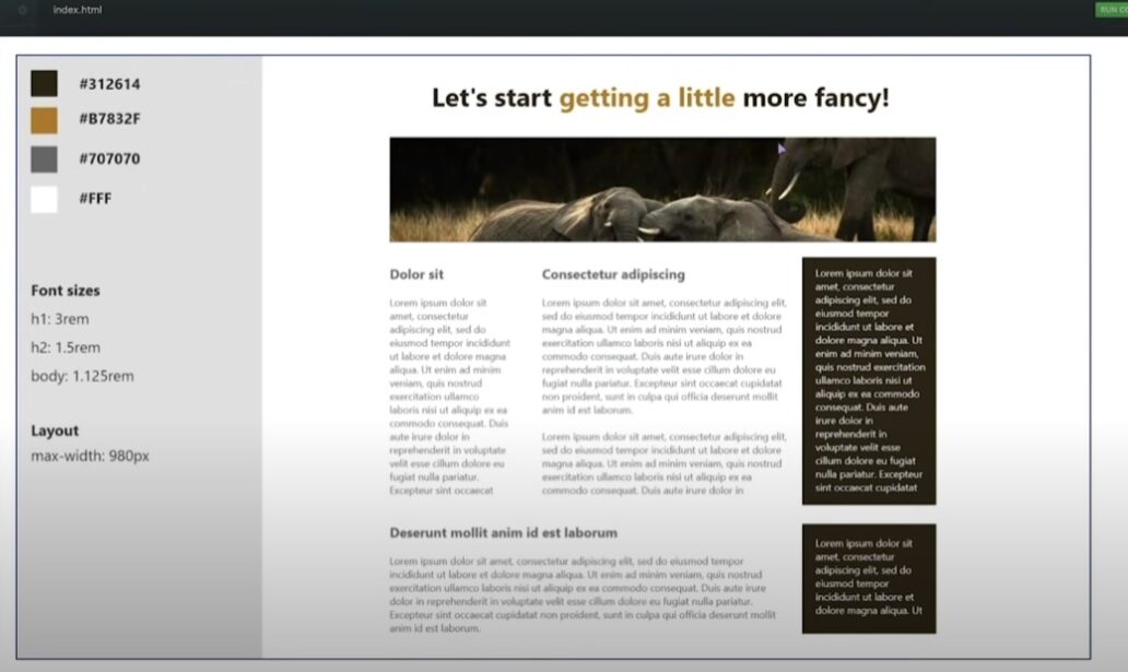
Responsive web design is a crucial aspect of modern web development. With the increasing use of smartphones, tablets, and other mobile devices, it is essential to ensure that websites can adapt to any screen size. In this article, we will explore how to create websites that adapt to any screen size.
What is Responsive Web Design?
Responsive web design is an approach to web development that aims to create websites that can adjust to different screen sizes. This is achieved by using a combination of flexible grids, images, and CSS media queries to adjust the layout and design of the website based on the screen size of the device being used.
Why is Responsive Web Design Important?
Responsive web design is essential for several reasons. First, it improves the user experience by ensuring that the website is easy to navigate and read on any device. This is important because more and more people are using mobile devices to access the internet, and they expect websites to work seamlessly on their devices.
Second, responsive web design is critical for search engine optimization (SEO). Google and other search engines now consider the mobile-friendliness of websites as a ranking factor. Therefore, if your website is not responsive, it may not rank well in search engine results pages (SERPs), which can have a significant impact on your website traffic and conversions.
How to Create a Responsive Website
Here are the steps to create a responsive website:
1. Use a Flexible Grid System
The first step to creating a responsive website is to use a flexible grid system. This involves using percentages instead of fixed pixels for the width of the website’s elements. By doing this, the elements will adjust automatically based on the screen size of the device.
2. Use Responsive Images
The next step is to use responsive images. This involves using images that can adjust automatically based on the screen size of the device. You can achieve this by using the srcset attribute in your HTML code. The srcset attribute allows you to provide multiple versions of the same image at different sizes and resolutions.
3. Use CSS Media Queries
The final step is to use CSS media queries to adjust the layout and design of the website based on the screen size of the device. CSS media queries allow you to define different styles for different screen sizes. For example, you can define a different font size or layout for mobile devices than for desktop devices.
Best Practices for Responsive Web Design
Here are some best practices for responsive web design:
1. Keep it Simple
When designing a responsive website, it is important to keep it simple. This means avoiding complex layouts and design elements that may not work well on smaller screens.
2. Prioritize Content
When designing a responsive website, it is also important to prioritize content. This means ensuring that the most important content is visible and accessible on all screen sizes.
3. Test on Different Devices
It is essential to test your website on different devices to ensure that it works well on all screen sizes. This includes testing on smartphones, tablets, laptops, and desktops.
4. Use a Content Delivery Network (CDN)
Using a content delivery network (CDN) can help improve the performance of your responsive website. A CDN can distribute your website’s content across multiple servers, reducing the load time of your website and improving its overall performance.
Responsive web design is essential for creating websites that can adapt to any screen size. By using a combination of flexible grids, images, and CSS media queries, you can create a website that looks great and works seamlessly on any device. Remember to keep it simple, prioritize content, test on different devices, and use a content delivery network (CDN) to improve performance. With these best practices in mind, you can create a responsive website that meets the needs of your target audience and drives conversions.
